

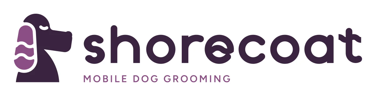
Shorecoat is a one-person mobile dog groomer working from a van in Heswall, West Kirby and Neston. Its home-made logo was hard to read and looked like every other groomer’s; the new one is a drawn spaniel and a drawn wordmark that work from a van side down to 16 pixels. The business is invented, and the logo was drawn as an example of how we work.
Business: Mobile dog groomer · Area: Heswall, West Kirby and Neston · Type: Drawn wordmark, Figtree · Colours: 4 · Files: SVG and PNG · Guide: One page
The business
One groomer, one van. The van parks outside the house, the dog is groomed inside, one at a time, and goes back through the front door clean. The customers are busy owners, many of them older couples with a spaniel, and families with a nervous dog that hates a busy salon.
What they are buying is calm: no cages, no queue, the same person every time. The logo has to say that on the van, a polo shirt, a rubber stamp for visit cards and a round profile picture.
What they had
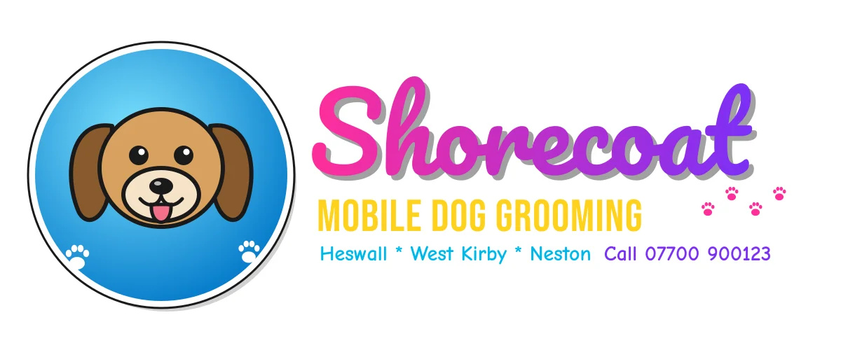
The owner made the first logo in an evening: a cartoon dog in a blue gradient badge, the name in a pink-to-purple script with a drop shadow, and two more fonts below.
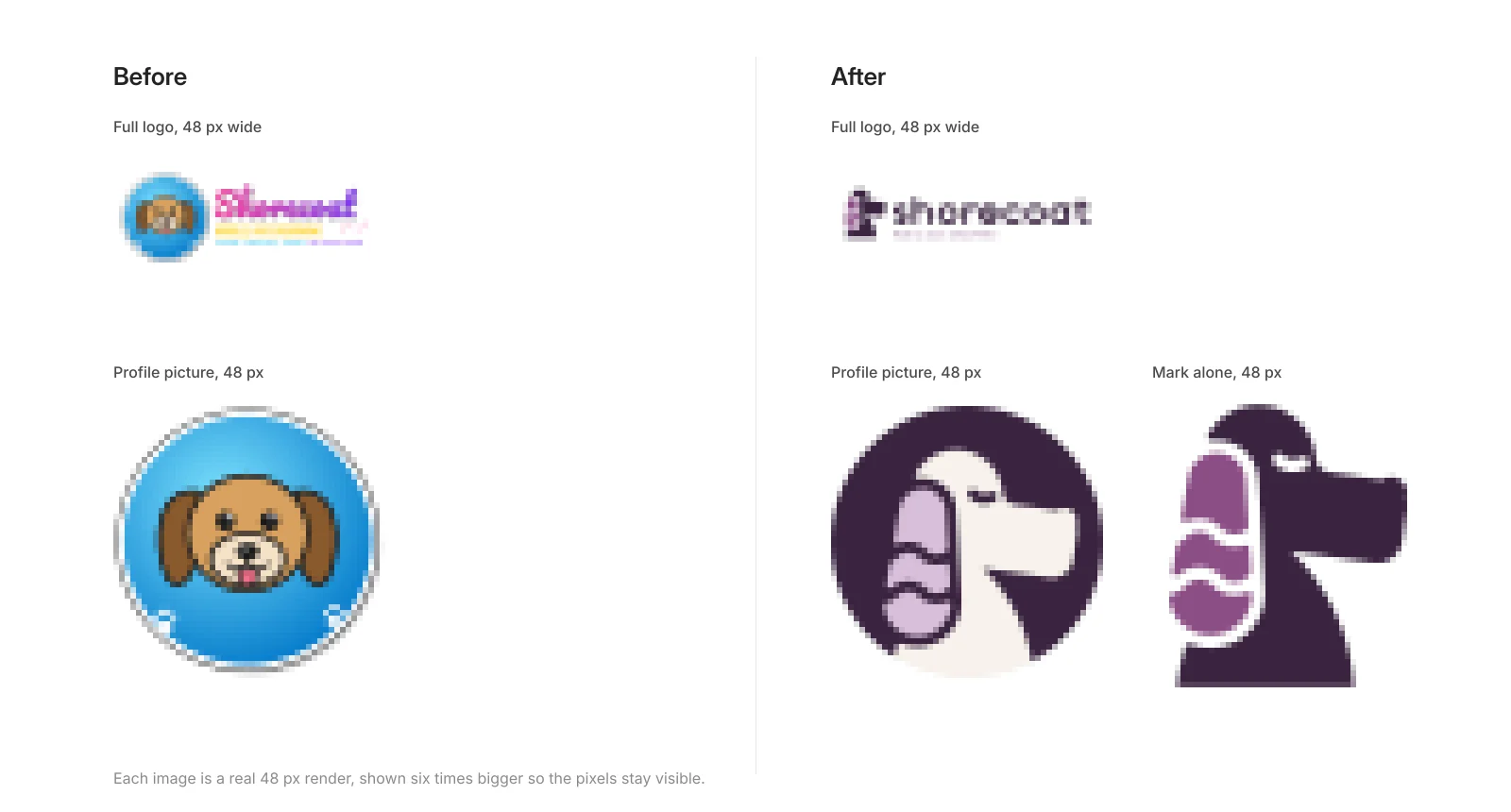
It had three problems. The dog was the stock cartoon dog, big eyes and tongue out, so it could belong to any groomer and read as cute rather than trustworthy. The gradient script fell apart small: at 48 pixels wide the name is a pink smear. And the colours failed contrast: the yellow strapline is 1.5 on white, the cyan line 2.3.
The brief
A short call covered what Shorecoat does, who the customers are, and three brands the owner likes the look of, which we noted as qualities rather than logos to copy.
The logo had to say dog and grooming at a glance, feel warm and trustworthy without turning cute, work in one colour and reversed, and hold up at 24 pixels. No paw prints, bones or tongues. One direction, not three to choose from.
- A seaside café: warm off-white and one deep colour
- An outdoor clothing maker: one animal as a solid shape, with one clever detail
- An independent bookshop: a warm serif name set with care
Sketches
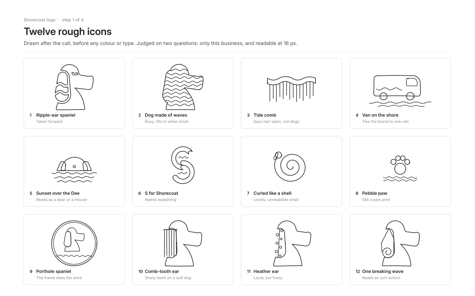
Twelve rough icons, judged on two questions: does it say this business and nobody else, and will it read at 16 pixels?
- Ripple-ear spaniel: kept. One shape says dog, one detail says sea.
- Dog made of waves, tide comb, pebble paw: busy, or a category symbol.
- Van on the shore: ties the brand to one van.
- Sunset over the Dee, curled shell: lovely large, unreadable small.
- S monogram, porthole: the frame or the letter does the work, not an idea.
- Comb-tooth, heather and breaking-wave ears: sharp, fussy, or surf school.
The direction
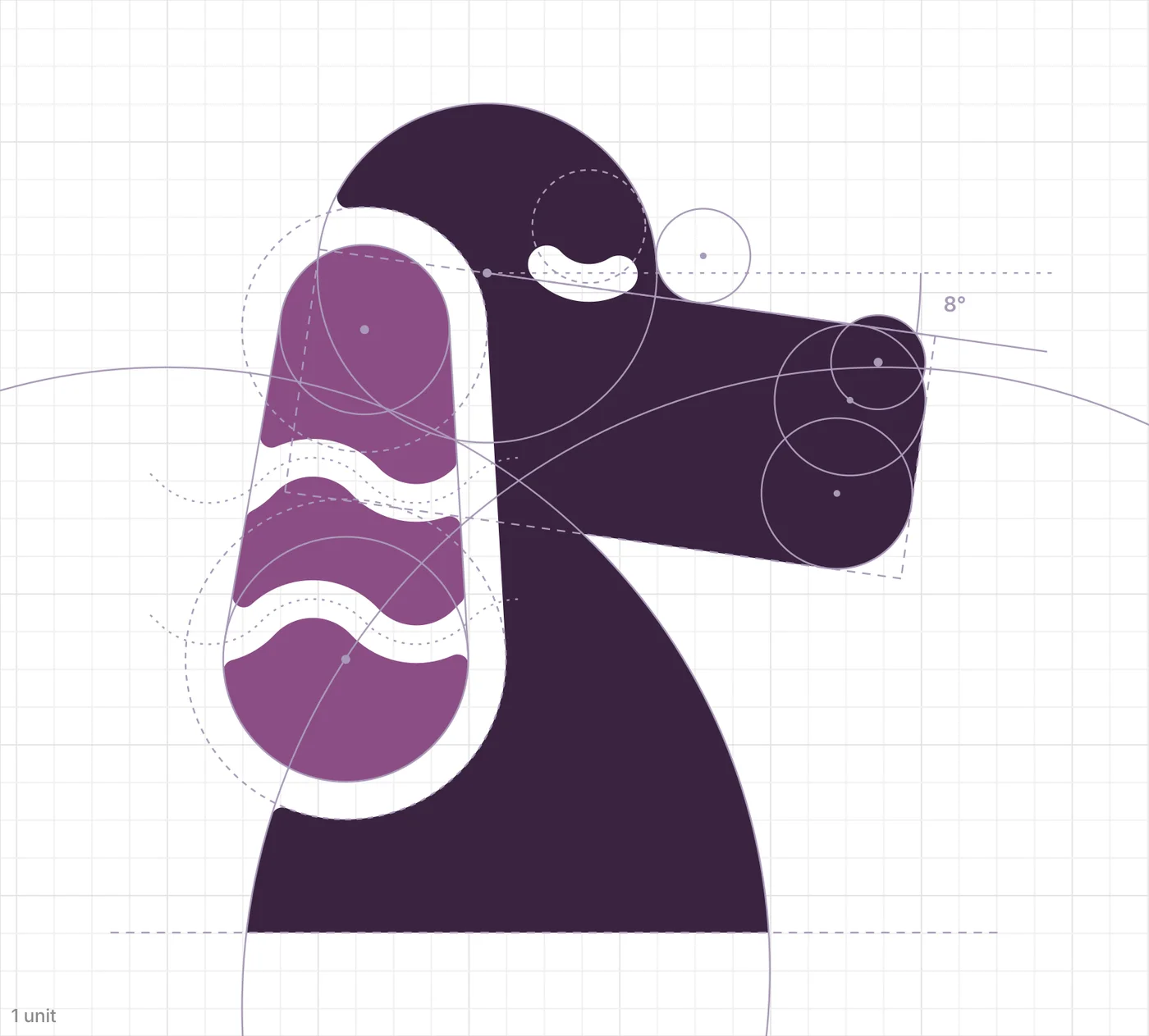
A spaniel in profile, at rest, eyes closed, head lowered by 8 degrees. Its long ear is cut into three bands by two waves, and reads three ways: a spaniel’s wavy ear, a freshly combed coat, and the ripples the tide leaves on West Kirby sands. The closed eye is the promise: a calm dog.
Every shape is circles, arcs and straight lines on a one-unit grid. The ear is two circles joined by tangents; the neck is where two large circles overlap, cut flat to sit on the strapline’s baseline. The gap round the ear, both waves and the eye are all one unit wide, so the mark has a single line weight.
Early heads without a neck looked like a duck, and a big skull like a puppy, so we added a neck and shrank the skull. Where the waves leave the ear, eight sharp points got small rounded corners. It holds small because it is one solid silhouette: when the waves are too fine to see, the dog is still there.
The wordmark
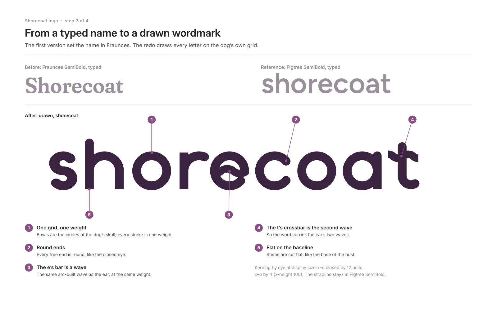
The first version typed the name in Fraunces. It was well spaced but it was a font, and nothing in it belonged to the dog. So we drew the word ourselves, in lower case, on the dog’s own grid.
The bowls are the circles of the skull, every stroke has one weight, every free end is round like the closed eye, and stems stand flat on the baseline like the bust. The e’s bar is the ear’s wave and the t’s crossbar is the second wave, so the word carries both. Two pairs were kerned by eye.
The strapline and everything else the business writes are set in Figtree.
| Pair | Change (x-height 100) |
|---|---|
| r e | −12 |
| c o | −4 |
The colour
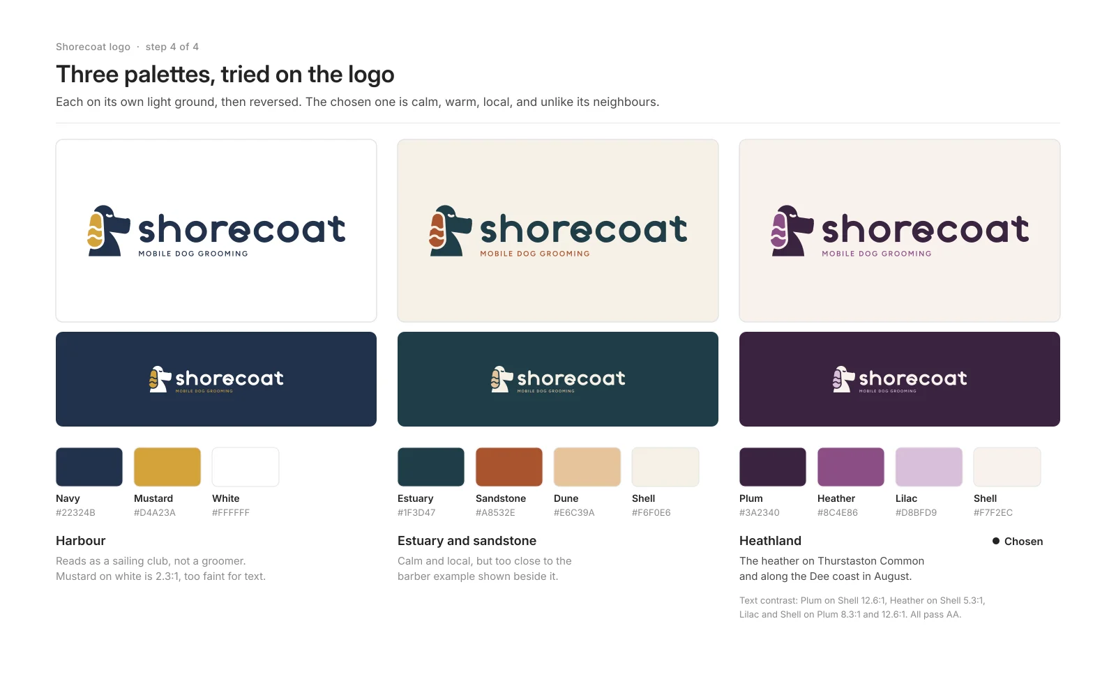
Three palettes were tried, light and reversed. Navy and mustard looked like a sailing club, and mustard on white is too faint to read. Teal and sandstone suited the coast but was too close to another example logo on the same page.
Heathland won: the plum and heather of Thurstaston Common in August, minutes from all three towns. Four colours, one job each, and every text pairing passes WCAG AA for small text. Lilac is never text on Shell (1.5) and Heather never text on Plum (2.4), which is why the ear turns lilac on dark backgrounds.
| Colour | HEX | Used for | Contrast |
|---|---|---|---|
| Plum | #3A2340 | Text, the dog, dark backgrounds | 12.6 on Shell |
| Heather | #8C4E86 | The ear, the strapline | 5.3 on Shell |
| Lilac | #D8BFD9 | The ear on dark backgrounds | 8.3 on Plum |
| Shell | #F7F2EC | Backgrounds | 12.6 with Plum |
Small sizes and the profile picture
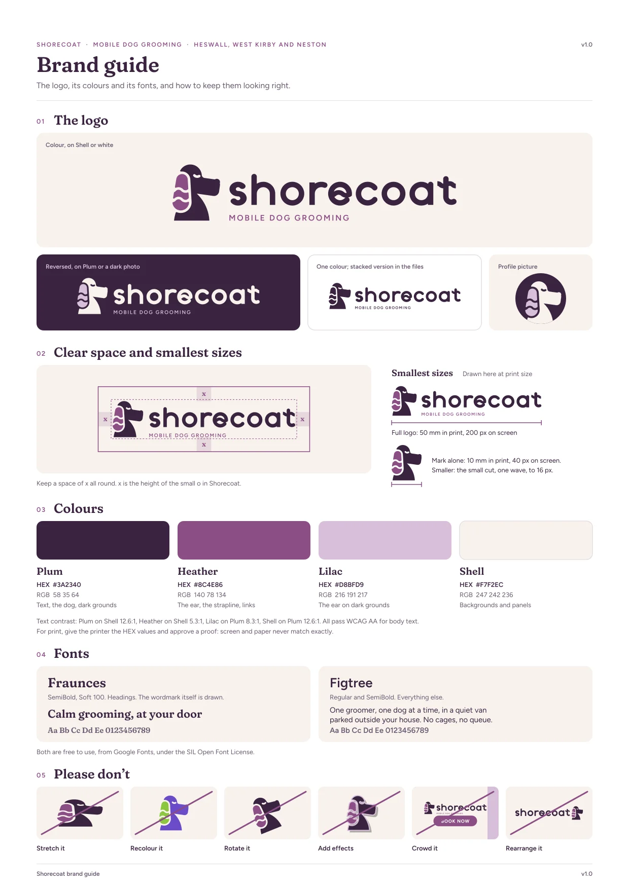
Every file was tested at its real pixel size. At 48 pixels the mark keeps its bands, gap and eye. At 32 and below it switches to a small cut, one wave, no eye and a wider gap, which reads at 16. The full logo works down to 200 pixels wide or 50 mm in print; below that, the mark goes on its own.
The profile picture is its own square file. The dog rises from the bottom edge, sized and placed so the head and ear sit inside the circle crop with equal margins; only the neck is cut.
In use
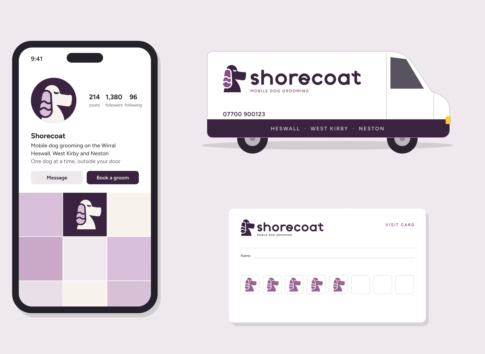
We drew the logo where it will live: on the van, as a phone profile picture, and stamped in one colour on a visit card. They are flat drawings, made to check real proportions before printing.
The guide
Everything fits on one A4 page, to keep in the van or send to a printer.
- Every version of the logo
- Clear space: the height of the small o, all round
- The smallest sizes, drawn at print size
- The four colours with HEX, RGB and contrast
- The two fonts and where to download them
- Six things not to do to the logo
What they got
- The logo in colour, one colour and reversed, as SVG and PNG
- The mark on its own, plus a small cut for 16 to 32 pixels
- A stacked version of the logo
- A square profile picture built for the circle crop
- Four colours with HEX and RGB values
- A drawn wordmark, and Figtree for everything else
- A one-page brand guide
If your logo looks like Shorecoat’s old one, we can start with the same short call, then draw one direction and finish it properly.
Want a logo drawn like this for your business? See Logo and brand basics


