

Carpintaria S. Braz is a joinery works in Sandim, Vila Nova de Gaia, working in wood since 1987, and a client whose website we built. This is a proposal for a real client, not yet agreed with them. It keeps what people know, the letters CSB, the open ring and the copper, and redraws them as one interlocked monogram with a wordmark to match.
Their website, which we built, is at carpintariasaobraz.pt.
Business: Joinery and carpentry · Place: Sandim, Vila Nova de Gaia · Since: 1987 · Fonts: Josefin Sans (redrawn), Barlow · Colours: 4 · Status: Proposal, not yet agreed
The business
Carpintaria S. Braz, Ramos & Ramos, Lda., makes kitchens, wardrobes, bathroom furniture, staircases, doors and window frames to measure in its own workshop, and fits them with its own team around Vila Nova de Gaia and Porto. Quotes start on WhatsApp from the website.
So the mark has to work as a profile picture and a browser tab, and also be embroidered on a jacket, cut in vinyl for a van and fixed to the workshop wall.
What they have
A CSB monogram in an open circle, filled with wood-grain stripes in two browns. The only file is a small raster, 132 pixels wide; there is no vector and no larger version, so this page enlarges that one image.
Worth keeping: the three letters, the open ring and the copper, which is also the website’s colour. The limits: the stripes are about a pixel wide in two browns only 1.71 apart, so small they blur to flat brown; the joints are hairlines; the B has no upright and reads like a 3; and nothing can be printed large or cut.
At 48 pixels
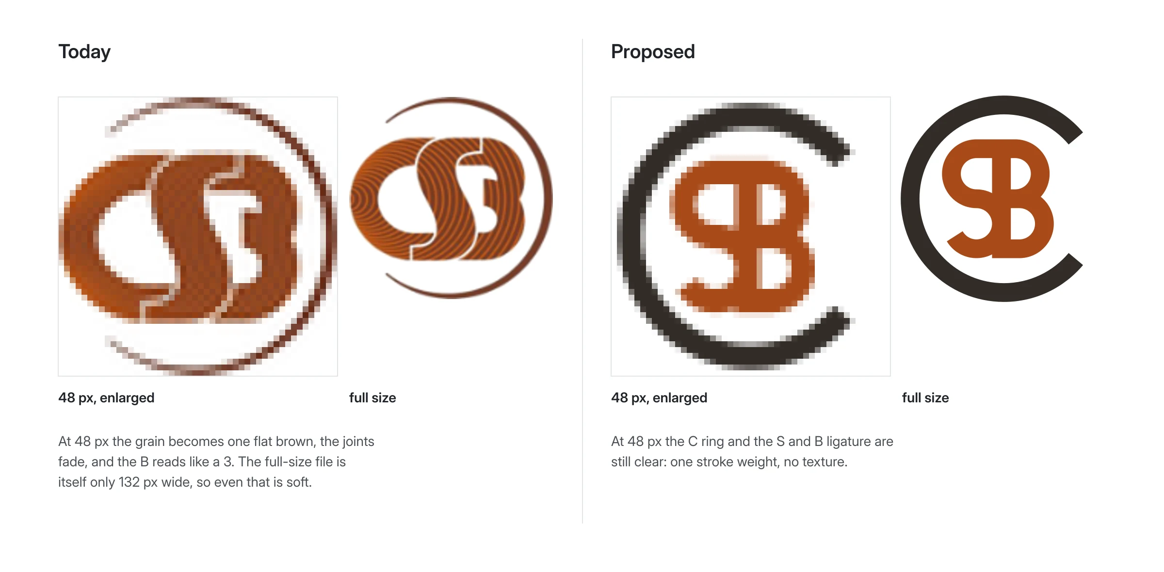
The 48-pixel versions of both marks, enlarged with hard square pixels, beside each mark at full size. The current one loses its grain and its B. The proposed one keeps the C ring and the S and B.
The brief
There has been no call yet, so this brief is ours, from their site, and the first thing we would check with them. The owner of this proposal asked for a mark that reads as CSB, feels established and warm but modern, and could be embossed, stamped, cut and embroidered.
- Keep: the letters CSB, the open ring with the C breaking out, the copper.
- Change: grain as texture, three separate letters, hairlines.
- Avoid: generic joinery symbols, and anything another studio has already drawn for another carpenter.
Twelve sketches
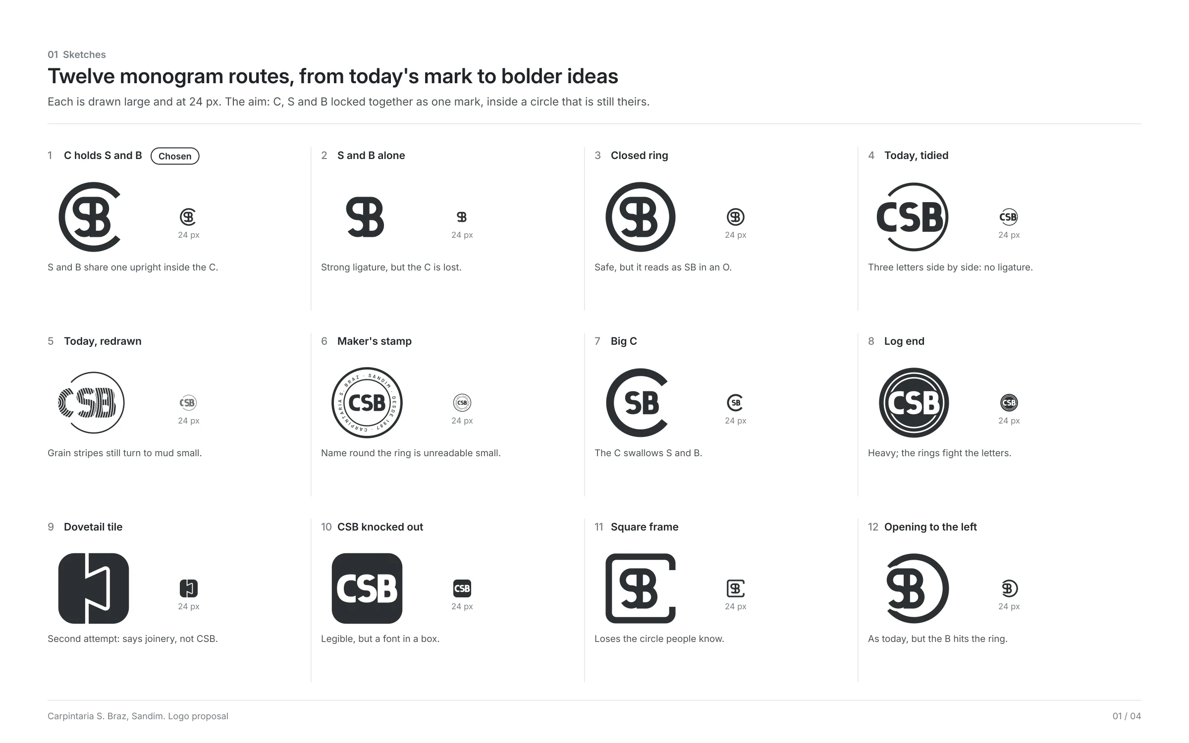
Twelve monogram routes, each at full size and at 24 pixels, from a tidy version of today’s mark to a log end and the dovetail tile of our second attempt, which said joinery but not CSB.
- C holds S and B: chosen. One mark, reads as CSB at 24 pixels.
- Closed ring: reads as SB in an O.
- Today tidied, or redrawn: three letters side by side, or grain that fails small.
- Maker’s stamp: the name round the ring is unreadable small.
- Dovetail tile and CSB in a box: no longer theirs, or a font in a box.
The direction: the C is the ring
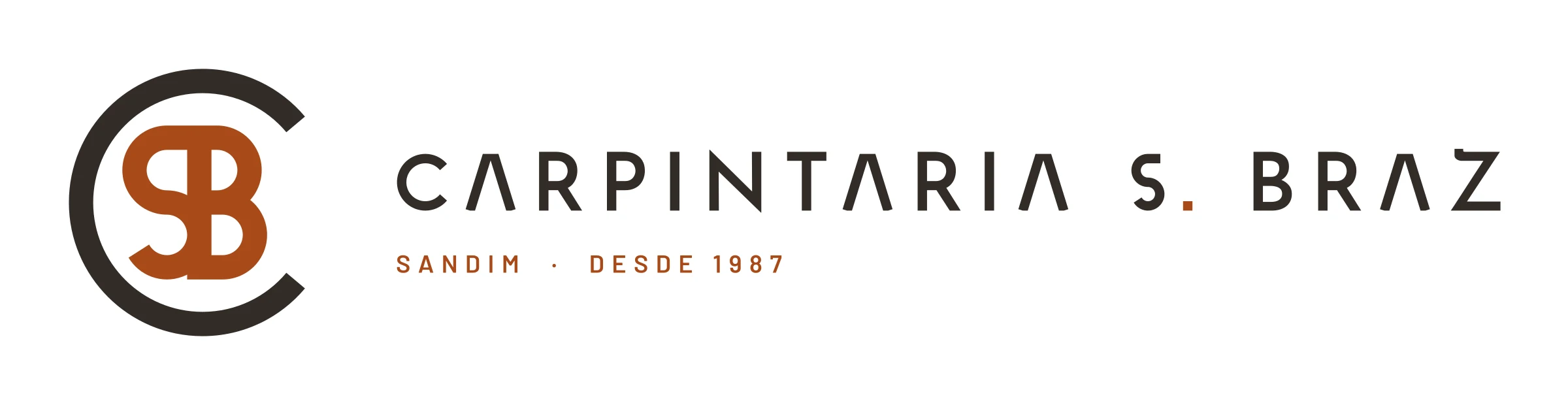
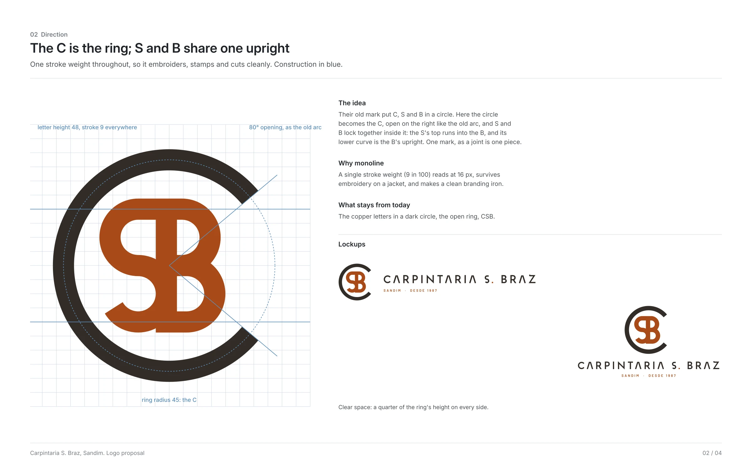
Their old mark set C, S and B inside an open circle. Here the circle becomes the C, open on the right with the same 80 degree gap, and the S and B lock together inside it: the S’s top bar runs straight into the top of the B, and the S’s lower curve is the B’s upright. Two letters share strokes the way two pieces of a joint share a shoulder.
Everything is one stroke weight, 9 units on a 100-unit ring, so it reads at 16 pixels, embroiders cleanly and makes a good branding iron. Copper letters in a dark ring keep the colours of the old mark.
The type
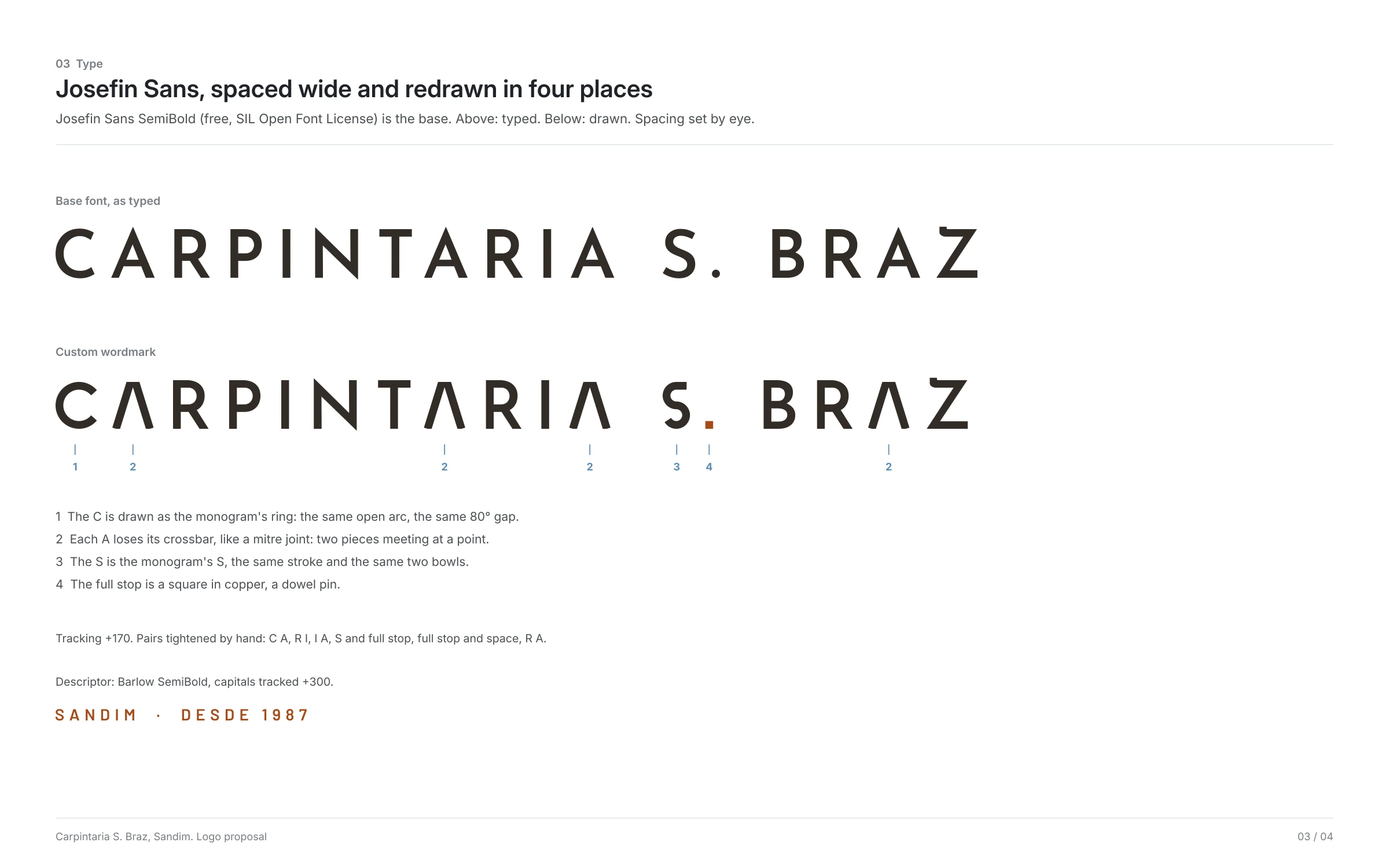
The name is set in Josefin Sans SemiBold, a free geometric face by Santiago Orozco, in capitals spaced wide, then drawn over in four places: the C becomes the monogram’s open ring; each A loses its crossbar, like a mitre joint; the S is the monogram’s S; and the full stop is a copper square, like a dowel. Pairs were then tightened by eye.
The line under it is Barlow SemiBold in capitals tracked wide.
The colour
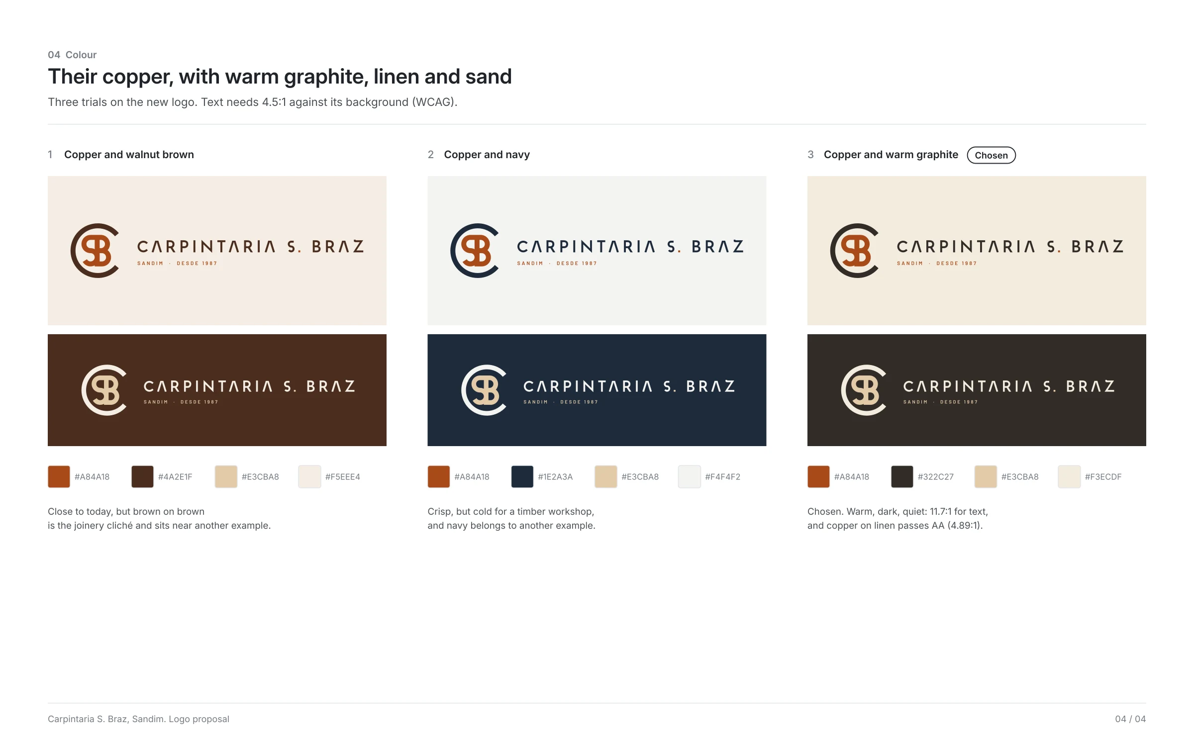
Three trials. Copper with walnut brown was closest to today but felt like every joinery, and sat near another example; copper with navy was crisp but cold. The chosen palette keeps their copper with a warm graphite, a linen and a sand.
Graphite on linen is 11.7 and copper on linen 4.89, both passing AA for text. Copper on graphite is only 2.4, so on dark grounds the letters turn sand.
| Colour | HEX | Use | Contrast |
|---|---|---|---|
| Cobre (copper) | #A84A18 | S and B, full stop, the line | 4.89 on linen |
| Grafite (warm graphite) | #322C27 | The C ring, name, text | 11.7 on linen |
| Areia (sand) | #E3CBA8 | S and B on dark grounds | 8.77 on graphite |
| Linho (linen) | #F3ECDF | Light grounds, ring on dark | 11.7 on graphite |
Small sizes and the profile picture
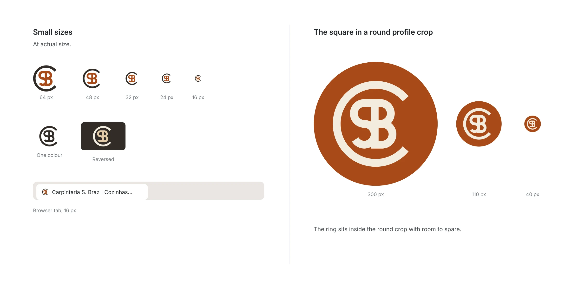
The monogram reads at 16 pixels, in one colour and reversed. In a round profile picture the ring sits inside the crop with room to spare. Below 340 pixels or 60 mm wide, use the monogram alone.
On the website
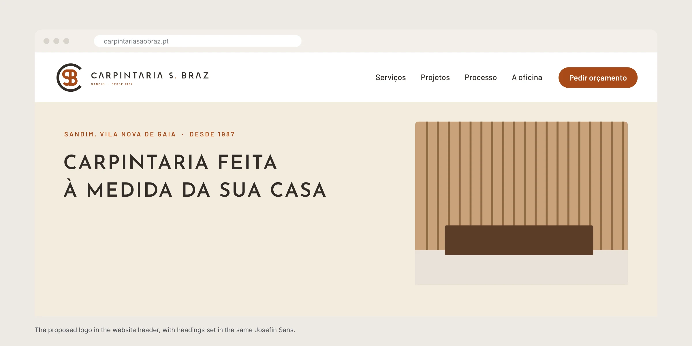
In the header at today’s height, with the headings set in the same Josefin Sans. The copper is already the site’s accent.
On the van
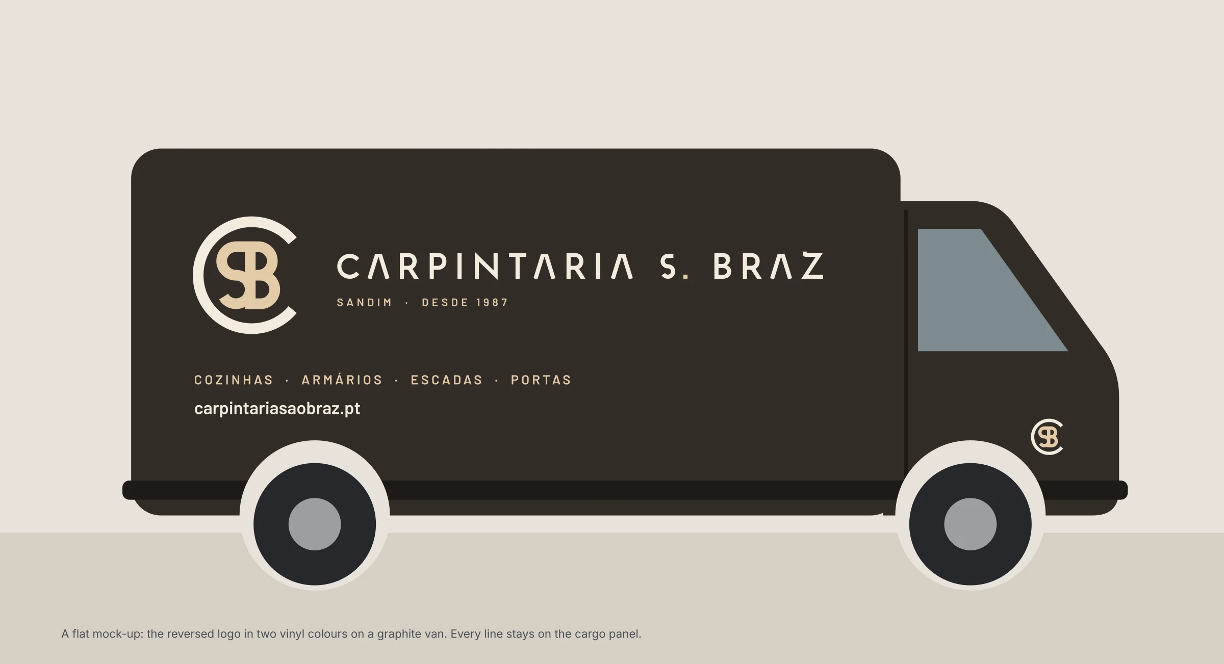
The reversed logo in two vinyl colours on a graphite van, with the services line kept on the cargo panel, clear of the door seam and the wheel arches.
On workwear
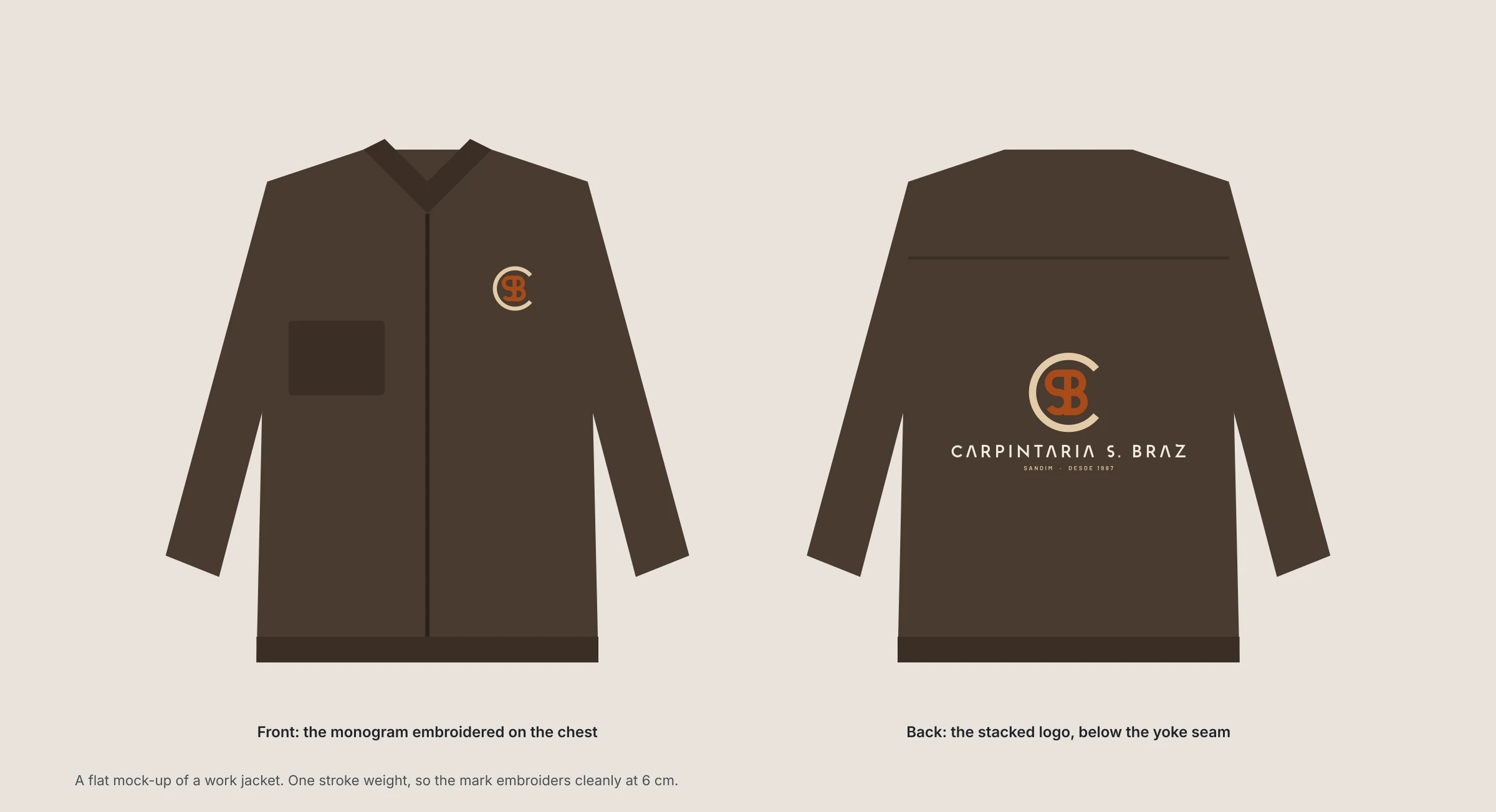
The monogram embroidered on the chest of a work jacket, and the stacked logo across the back, below the yoke seam.
The workshop sign
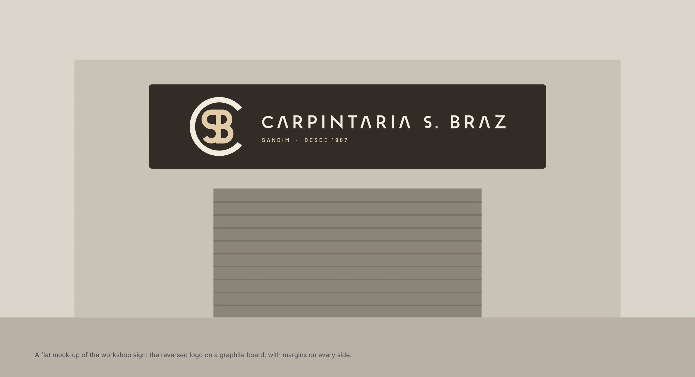
The reversed logo on a graphite board above the workshop door, with a margin on every side.
Business card and profile picture
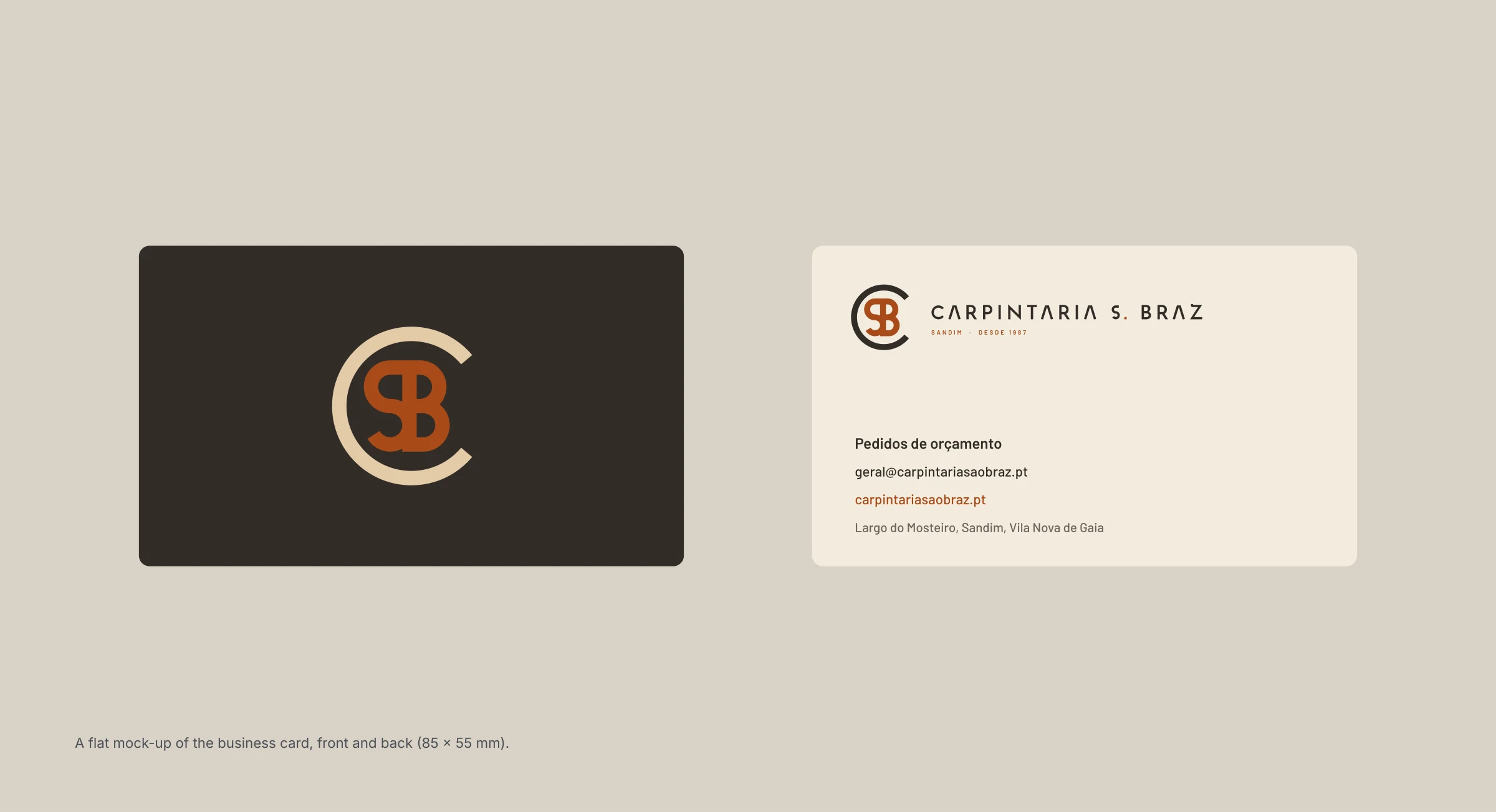
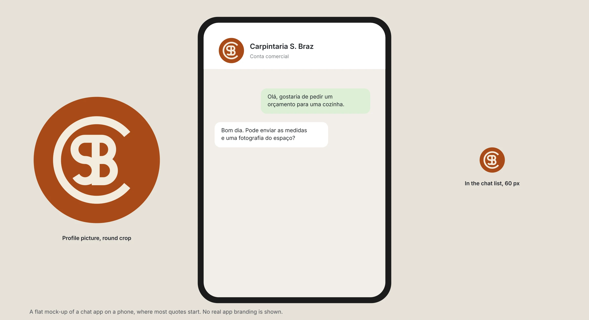
The card carries the monogram alone on the front and the logo with contact details on the back. On the phone, where most quotes start, the round profile picture is the monogram in linen on copper.
The chat profile
At 60 pixels in a chat list the C ring and the SB are still clear.
The guide
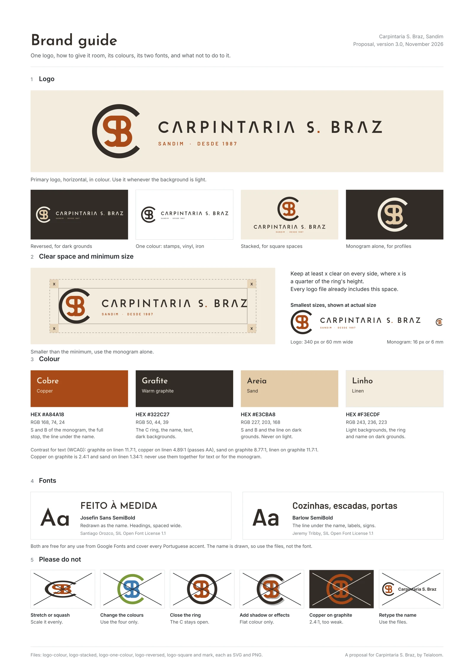
Everything above on one page: the logo in its forms, clear space, minimum sizes, colours with contrast, fonts and six things not to do.
What they would get
- The logo horizontal and stacked, in colour, one colour and reversed, as SVG and PNG
- The monogram on its own
- A square profile picture that survives a circle crop
- Four colours with HEX and RGB values and contrast ratios
- Two free fonts, one redrawn as the name
- A one-page guide
If your logo only exists as a small image, it can usually be kept and redrawn so it works everywhere. Ask us what we would keep.
Want a logo drawn like this for your business? See Logo and brand basics


